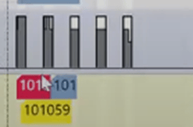
In the VAPS, you have the option to view histograms of work centers and their associated machine centers. These histograms allow you to easily identify available capacities, as well as any instances where capacities have been exceeded, indicated by red markings.
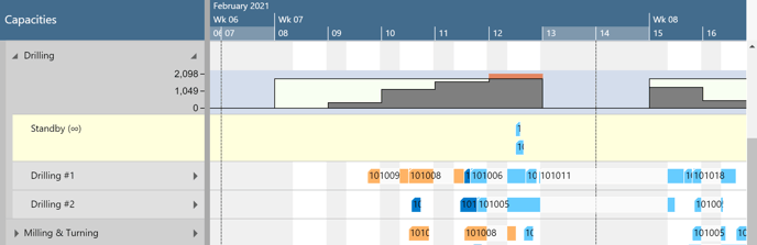
The histogram is a capacity utilization chart:
- The outer (black) line shows you the maximum available capacity per selected aggregation (derived from the capacity of the underlying machine centers).
- The grey-filled area indicates how much of that available capacity will be utilized by the current schedule.
- The red area indicates that, according to the current schedule, you will need more capacity than what is available on Friday, February 12th.
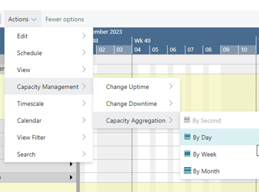
By “Actions”-> Capacity Management” -> ”Capacity Aggregation” you can select the aggregation that fits your requirements best.
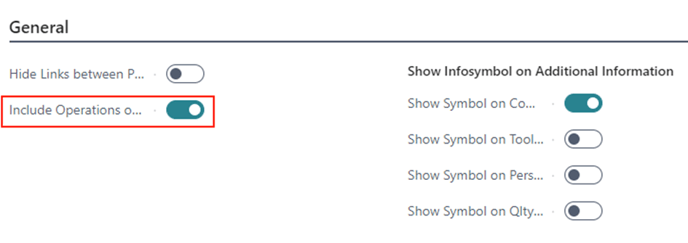
Include/exclude standby operations for the load curve
Until version 15 of the VAPS, the workload shown in the histogram was determined by considering both the scheduled production orders and those on standby, as shown in the picture below:
However, we have recognized that our customers have varying preferences. Some require a histogram that exclusively reflects the current workload, while others prefer to include standby operations for a comprehensive view, enabling them to identify potential bottlenecks or unrealistic delivery times. To accommodate these diverse needs, we have introduced a new switch in the VAPS setup dialog. This allows users to specify whether they want to include standby operations in the histogram or not.
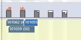
This is what our example from above looks like when the operations on standby are excluded from the load curve: